The statistical programming language “R” is used for statistical analysis, data visualization, and other data science applications. Using “plotly”, a chart and plot library for R, we’ll create stacked bar chart graphs and plots.
To be honest, R was actually the third language I touched when I started programming. First was Ruby, then Autohotkey, and then for some reason I started R. This story has nothing to do with this article.
Recently, I’ve been starting with Raspberry Pi, playing with Chrome search history databases, making time management tools, and so on - I’ve had many opportunities to work with log data and SQLite. I was thinking about analyzing these with Python, but I heard that R might be better, so I decided to try it out.
So let’s start with installation.
Download and install RStudio 1.2.1335 - Windows 7+ (64-bit) from the following:
If you’re wondering why I’m installing on Windows rather than Ubuntu, please see the following article:
[I wanted to use R interactively in Bash but gave up]
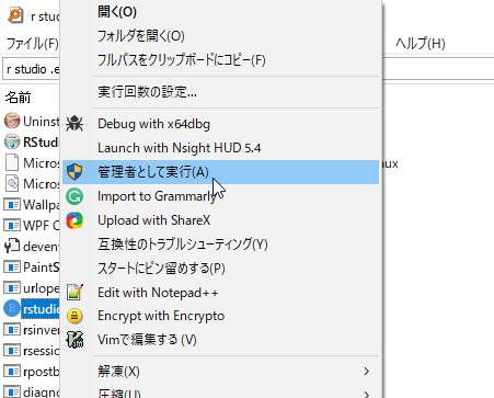
After installation is complete, open rstudio.exe with administrator privileges.
If you run it without administrator privileges, you won’t be able to properly install external packages with install.packages(). You’ll get errors like the following:
Error in install.packages : unable to create 'C:/Users/OneDrive/??????/R/win-library/3.6'r - Make a file writable in order to add new packages - Stack Overflow Unable to update R packages in default library on Windows 7 - Stack Overflow
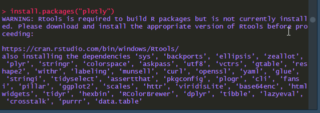
After opening the executable with administrator privileges, run install.packages("plotly") to install plotly.
When operating from a file, select the install.packages("plotly") part and press Ctrl+Enter to execute.
Then copy and paste the following script and run it.
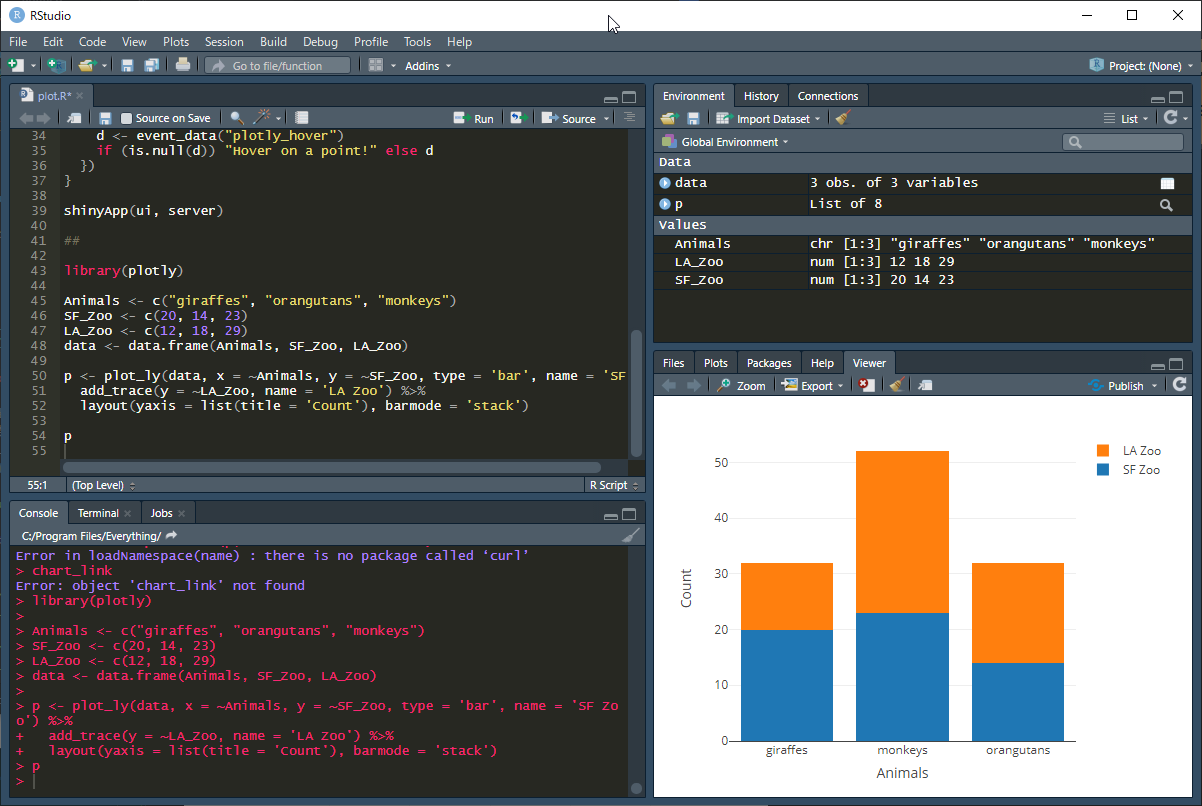
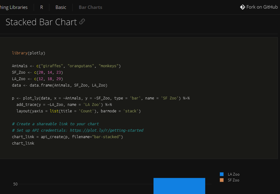
library(plotly)

Animals <- c("giraffes", "orangutans", "monkeys")
SF_Zoo <- c(20, 14, 23)
LA_Zoo <- c(12, 18, 29)
data <- data.frame(Animals, SF_Zoo, LA_Zoo)

p <- plot_ly(data, x = ~Animals, y = ~SF_Zoo, type = 'bar', name = 'SF Zoo') %>%
  add_trace(y = ~LA_Zoo, name = 'LA Zoo') %>%
  layout(yaxis = list(title = 'Count'), barmode = 'stack')

p
The above script is copied from Bar Charts in R | Examples | Plotly. You might want to criticize me for writing such a derivative article, but before that, take a close look at this page and compare it with the above script.
…
The last p is missing, so the graph won’t display. This is tough for R beginners. I assume that if you execute p to display the graph, it stops before the subsequent API stuff can run. I wish they would comment that you can display the graph with p here. I almost mistakenly tried to create an API.
(Here’s proof.)
Summary
This article explains how to create stacked bar charts using the statistical programming language R and its library Plotly. Here’s an overview of the key points and script:
-
Installing R and RStudio:
- Install RStudio and run it with administrator privileges. Without administrator privileges, errors may occur when installing packages.
-
Installing the Plotly Library:
- Install the
plotlypackage. Run the following command in the console in RStudio.
install.packages("plotly") - Install the
-
Creating Stacked Bar Charts with Plotly:
- Create stacked bar charts using the
plotlypackage. - In the script, create data using
data.frameand create the graph with theplot_lyfunction. - Set axis labels and legends, and finally execute
pto display the graph.
- Create stacked bar charts using the
-
Notes:
- Don’t forget to execute
pin the script. By executingp, the graph will be displayed.
- Don’t forget to execute
This helps you understand how to create stacked bar charts using R and Plotly.